-> The 2nd page of the website was done not as a one article, but as many different sections. There is enough information to attract an audience to the article, but not enough to understand it without reading further. Which is very important, if the readers will get all the necessary information from the headlines they will not continue to read.
-> I've used the 2nd page to introduce the events that are happening, also crimes, and a lot of advertising. When doing the research I could see that websites rely on adverts a lot, the adverts vary from banks to entertainment.
-> I challenged the codes and conventions by making the website not too colorful and also not putting just photos in it. I've tried to add as much information as I could. I wanted to make the page interesting, I want the audience to be able to understand that anyone could find an interesting bit of information to them, because not everyone has the same taste and sam interests.
-> I always asked for feedback because I think it's very important, if not the most important thing. BY getting feedback I am able to make the work better and improve it continuously. Feedback given must always be considered because it's other people who will be reading the website, I need to hear what they have to say about it.
-> I spoke about lot of different topics on my website to make it more interesting, I didn't want to make it dull by only talking about economy or business. The reason for that is that when I did my research I realized that local newspapers and websites are also a bit entertaining, people like o know serious things but others read to relax, and they don't want to read about something depressing all the time.
-> I've added horoscopes box because I don't know how many news,newspapers or other informational websites I have seen, but I am pretty sue that all of them contained horoscope information. I know that it's not the most important part of the website, but people read it, I read it as well, so I thought it's worth putting it onto the 2nd page
-> All the photos were taken by me. I used some old photos that I took few years ago as well, I've tried to use interesting colorful photos to make the website look eye-catching
Thursday 5 May 2011


Thursday 21 April 2011
1st page. Website. Final.
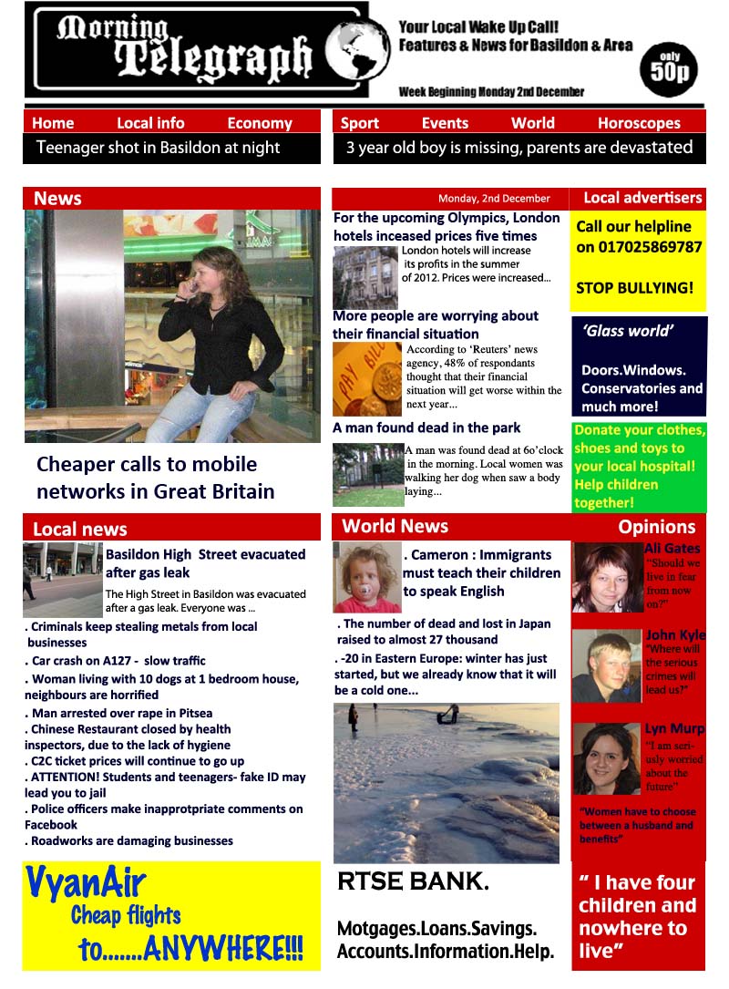
-> The website page is colourful and with lots of photos - it makes it eye catching.
-> The top of the website is taken from the actual newspaper, it's in black and white so stands out very well, audience always sees the name of the newspaper/website - also even though the newspaper is in black and white the website still suits the newspaper because it doesn't have too many colours. I've tried to make it look not too formal but also not too 'funky'
-> I left the background white because I wanted it to reflect the newspaper, which is local but also about business and economics, the website looks serious
-> The red line at the top is like a short cut - readers are able to see the main features and information that it in the website
-> Black line shows most recent and important news, it stand out very well which emphasizes the importance of the information
-> The website is divided into couple different sections, world news, local news, opinions and also advertisements. When doing my research I saw that all website promote something. My adverts are charity, helpline, bank and also air company. All of these help people somehow and it's useful. I've used air company because people like business men usually fly to different places so I decided that it would be a good addition to the website. All of the adverts are very simple, and in websites you are able to click on it and it takes you to the actual websites for it. The adverts must be simple in the website because if it;s very complex than it would be too much, because websites are colourful itself
-> This post contains photos that I took myself, because the other were taken from the internet. I've tried to use photos of people as much as I could because I realized that in websites photos are usually like that.
-> Local news section is big because the website is of a local newspaper. This will suit my audience because people reading this paper usually will be living in Basildon and Area, it will be important for them to know what's happening in their area. I've used photo of Basildon so that the readers would recognize the place straight away.
->In world news section I've placed a photo of a sea in winter, I took it when I was on holiday in Lithuania, I've used it to show that this section is about other places, and not England.
-> I decided to add section with opinions, because I think it's very important to make the reader feel that their opinions matter and that it's important for them to take part in what's happening in their community. Audience must see the newspaper and website helpful and interesting part of Basildon and Area.
-> I've used red colour to separate sections in order to make it clear when the one ends and another starts. I think it's very eye catching colour and is a good addition to the website.


-> I've added the title and logo of the newspaper at the top so the audience knows what newspaper website it is.
-> I've added few photos of people and their opinions because audience is able to see what other people think and they are able to express their views and also it gives them a feeling that their thoughts are important
Wednesday 6 April 2011

Monday 4 April 2011

I am going to use dark colours for writing because making it colourful would not make it look serious, which would be not good, because it's not how I want this website to look like - it wouldn't suit the purpose of it.

I added another big column with Local News. I've added one small photo, headline and little information about one of the points that I made. After that I am going to add more short statements about local news. I am not going to put photo next to each of them because it would be too much, it wouldn't look interesting and just look plain and the same.
The sentences will not always be correct or grammatically correct but the purpose of this would be that I need to make it interesting to catch the readers attention, I've looked at so many newspaper and websites headlines - and it's usually not too clear, but you still want to read it because it's persuading.
-> STYLE ACCORDING TO PURPOSE - the style of the sentences is, and will be structured the way so that it would drawn in the reader to click on it and find out more information.

The idea of these are that readers would be able to click on it and then it would take them to a website of a particular company, helpline etc... I didn't put number on all of them because when they click on it they would get all the information needed.
I also made it very simple, and just used bright colours to make it stand out. This is good because readers will see it clearly and be aware. Also it gives better opinion about the newspaper because it would show that it's trying not to just advertise but also help people (helpline).
Those adverts suit the target audience as well because everyone might need a helpline at some point in their lives, also everyone could help a charity and people also need doors or windows. The adverts have clear purpose and would be used a lot. This is why it would get a lot attention from people.
I didn't want to put a lot of information because then people might just think that it's too much and they will not be bothered to actually read it (if I see a lot of writing I don't always read it).


I did some research on the websites and found that most of them had a headline and then little bit information to make the reader intrigued to click on the article and read it further. I used photos next to each column because it represents what the article is about, because I realised that for example when I look at the website, I pay attention to pictures a lot, because if I see a clear photo I understand what the article is about without reading it. BUT, on the other side reader might interpret the photo differently, so I have to be clear and think my photos through, because I don't want to give the reader mixed messages.
Website.
 I've started doing the website.
 Website will be more colourful but I will try to make it look as formal as possible. Obviously it will include fun information because I must draw the audience in. Website must have lots of photos and short articles in order to keep the readers attention. I will divide the page into smaller and bigger sections, every section will have a headline a photo and little information. Right now I will be using photos from then internet, but once my page is formed I will take my own photos and place it inside the page. I will use one main colour for the lines to separate the articles and the information. I don't want to make it too colourful but it needs to be eye - catching. Adding colour but also making it look a bit serious will suite my target audience, everyone but mostly older people. There will also be a lot old important information about the work and local news.
Thursday 24 March 2011
Research into local newspaper websites.
I looked through the internet and print screened few of them.
I looked at newspaper websites like the independent, and also websites like Echo. I also have some examples of Lithuanian websites.
Most of the website titles stand out so that people would see which newspaper website it is.
I like the fact that one of them has a video in, because it's more interesting to watch a video than read, audience will be persuaded to watch it when they see it at the middle of the page.
The websites are colourful, it's done this way to attract readers attention, newspaper can look serious and simple but the websites usually contain more photos and more colour.
I am thinking whether I should add the weather box on my website, because not all of them have it, I don't think it's necessary, but I am going to do more research on it.
I realised that the websites which have one or two big photos look better than the ones with just small photos, I will use one big photo on my website page as well, then I will use a lot of small ones as well.
I will add headlines of local and national news, because as I can see in all the other websites there's not only local news, I could find international news as well. Audience needs to have a lot of information to choose from and find what's most interesting to the individual.
The more information the website contains the wider audience it will have, because people are interested in different things, variety of topics will increase the readers circle.
I am going to use bright colour in my website to make it eye catching, I am thinking of adding red headlines.

 Lithuanian website.


 Lithuanian website

I looked at newspaper websites like the independent, and also websites like Echo. I also have some examples of Lithuanian websites.
Most of the website titles stand out so that people would see which newspaper website it is.
I like the fact that one of them has a video in, because it's more interesting to watch a video than read, audience will be persuaded to watch it when they see it at the middle of the page.
The websites are colourful, it's done this way to attract readers attention, newspaper can look serious and simple but the websites usually contain more photos and more colour.
I am thinking whether I should add the weather box on my website, because not all of them have it, I don't think it's necessary, but I am going to do more research on it.
I realised that the websites which have one or two big photos look better than the ones with just small photos, I will use one big photo on my website page as well, then I will use a lot of small ones as well.
I will add headlines of local and national news, because as I can see in all the other websites there's not only local news, I could find international news as well. Audience needs to have a lot of information to choose from and find what's most interesting to the individual.
The more information the website contains the wider audience it will have, because people are interested in different things, variety of topics will increase the readers circle.
I am going to use bright colour in my website to make it eye catching, I am thinking of adding red headlines.


Wednesday 23 March 2011
Poster - final
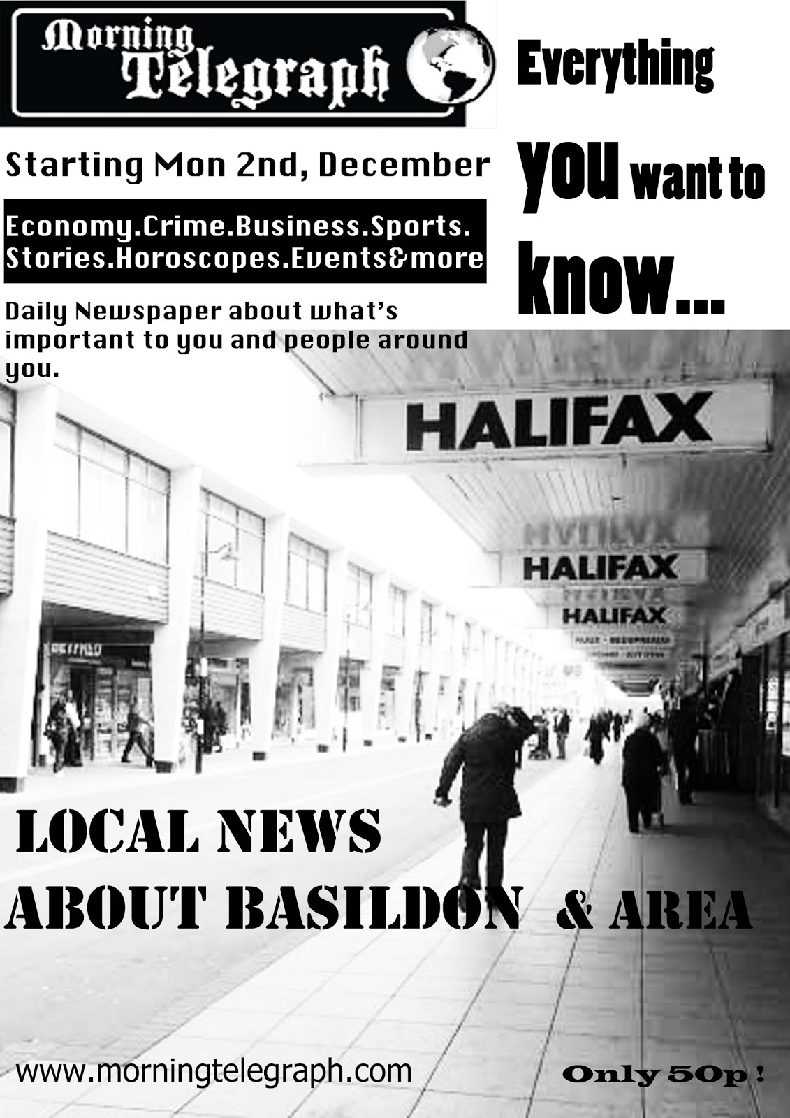
This is my poster - finished.
First of all, the fonts are clear, and easy to read, it will not be hard to read for older people. Also they will not have to look closely enough and look for information.
I didn't want to put too much information on it because then it wouldn't look eye catching and people won't be bothered to look at it and read it.
The fact that there's not a lot of writing makes it look better, also it's easy for the audience to read everything that is on the poster (the most important information and all they nee to know) in order to persuade them to buy the newspaper
I've also added the price at the sides because I think it's important for people to know how much it costs. I could've made the newspaper free, but decided that it should cost at least 50p, because good and more serious newspapers are not free
I've listed kind of content in the poster as well, in order for people to know what the newspaper is about and it's also a chance for them to decide if they would be interested in buying the newspaper or not. Because usually when I see a poster I want to know what it's about before I decide what to do next
Feedback on my poster.
I've asked some of the students and my teachers' opinions on the poster. These are the points that they made:
-> 'Local news about Basildon & Area' - make it stand out more, maybe the font more bold because it's important part of the poster but cannot be clearly seen, it blends out with everything else too much.
-> The writing at the top left hand corner could be not so squashed together, because now it look overcrowded. One side is with not a lot of writing - almost plain and on the other side there's too much going on
Apart from these points they said that the poster looks good and interesting.
My opinion is that it suits my target audience, I want the newspaper to be interesting and not for young teenagers, so the poster looks as it supposed to look like. I am not going to make it colourful or add funny pictures or anything like that on it.
Friday 11 March 2011
Poster. 2nd draft.

This is how the poster looks at the moment. I really like the photo, but I don't think that the word 'Basildon' and the logo of the newspaper look good at the top. It doesn't look good and looks like there's too much of everything. I need to either put less information in the poster or choose another photo because it looks too full of everything. The writing also doesn't stand out enough.
- poster should be more eye - catching to attract the audience and readers, it should be like an advertisement, so it must be very good
- it must look simple and the writing should be seen clearly, people don't want to look closely and then find what's written, they want to see it straight away, because it;s not a newspaper
- poster should not contain too much information, just basics of what's in the newspaper and usually contact info (at least an email)
This poster is good and suits the audience because
- photo is taken in Basildon town Centre, and everyone who lives in Basildon would be able to notice it straight away
- audience will be able to see the word 'Basildon' in the poster, they will understand what it's for
- they will also understand that it's for a newspaper because poster is in black and white and there's a newspaper name and logo at the top (although it's not very catchy at the moment) - I will improve that
This poster is not bad, but I think I can make it look much better, by doing more research and adding new improvements to it.
Research into newspaper covers and 2nd pages.
I've collected Metro newspapers over the last few months, I've scanned some of its 1st and 2nd pages as my research. I understand that Metro might not be a perfect example for a local newspaper , but it's helpful in developing my first and second pages. I can look for ideas to help me make my newspaper look interesting.
I also bought The sun, Echo and The Recorder newspapers in order to look how other newspapers look like, because even though the internet is very helpful, sometimes it's better to look at the actual newspaper. I wanted to look at as many examples as possible before making and while making my pages and also poster. Looking at many different newspapers enables me to choose the best ideas for my newspaper to make the audience interested.
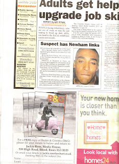
I've scanned the newspapers, it's not the best quality but you can see how the pages look like.
Front Covers.


I also bought The sun, Echo and The Recorder newspapers in order to look how other newspapers look like, because even though the internet is very helpful, sometimes it's better to look at the actual newspaper. I wanted to look at as many examples as possible before making and while making my pages and also poster. Looking at many different newspapers enables me to choose the best ideas for my newspaper to make the audience interested.
I've scanned the newspapers, it's not the best quality but you can see how the pages look like.
Front Covers.


2nd Pages.


I was thinking of using JUST adverts for my second page but decided that it might be too simple and not interesting. I want the newspaper to be smart and not boring. So I am going to use some adverts , but I might also add an article or something like that to make the page look more interesting. I must add the newspaper's name and page number at the top, because I think that's one of the most important things. Reader must know which page they are at and how to find it by looking at the content.
I will have contents page as well, just to let reader know what's in the paper.
Subscribe to:
Posts (Atom)