Thursday 24 March 2011

Research into local newspaper websites.

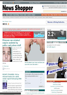
I looked through the internet and print screened few of them.

I looked at newspaper websites like the independent, and also websites like Echo. I also have some examples of Lithuanian websites.
Most of the website titles stand out so that people would see which newspaper website it is.
I like the fact that one of them has a video in, because it's more interesting to watch a video than read, audience will be persuaded to watch it when they see it at the middle of the page.
The websites are colourful, it's done this way to attract readers attention, newspaper can look serious and simple but the websites usually contain more photos and more colour.
I am thinking whether I should add the weather box on my website, because not all of them have it, I don't think it's necessary, but I am going to do more research on it.
I realised that the websites which have one or two big photos look better than the ones with just small photos, I will use one big photo on my website page as well, then I will use a lot of small ones as well.
I will add headlines of local and national news, because as I can see in all the other websites there's not only local news, I could find international news as well. Audience needs to have a lot of information to choose from and find what's most interesting to the individual.
The more information the website contains the wider audience it will have, because people are interested in different things, variety of topics will increase the readers circle.
I am going to use bright colour in my website to make it eye catching, I am thinking of adding red headlines.


 Lithuanian website.


 Lithuanian website

Wednesday 23 March 2011

Poster - final


This is my poster - finished.

First of all, the fonts are clear, and easy to read, it will not be hard to read for older people. Also they will not have to look closely enough and look for information.
I didn't want to put too much information on it because then it wouldn't look eye catching and people won't be bothered to look at it and read it.
The fact that there's not a lot of writing makes it look better, also it's easy for the audience to read everything that is on the poster (the most important information and all they nee to know) in order to persuade them to buy the newspaper
I've also added the price at the sides because I think it's important for people to know how much it costs. I could've made the newspaper free, but decided that it should cost at least 50p, because good and more serious newspapers are not free
I've listed kind of content in the poster as well, in order for people to know what the newspaper is about and it's also a chance for them to decide if they would be interested in buying the newspaper or not. Because usually when I see a poster I want to know what it's about before I decide what to do next

Feedback on my poster.

I've asked some of the students and my teachers' opinions on the poster. These are the points that they made:

-> 'Local news about Basildon & Area' - make it stand out more, maybe the font more bold because it's important part of the poster but cannot be clearly seen, it blends out with everything else too much.
-> The writing at the top left hand corner could be not so squashed  together, because now it look overcrowded. One side is with not a lot of writing - almost plain and on the other side there's too much going on

Apart from these points they said that the poster looks good and interesting.

My opinion is that it suits my target audience, I want the newspaper to be interesting and not for young teenagers, so the poster looks as it supposed to look like. I am not going to make it colourful or add funny pictures or anything like that on it.

Friday 11 March 2011

Poster. 2nd draft.


This is how the poster looks at the moment. I really like the photo, but I don't think that the word 'Basildon' and the logo of the newspaper look good at the top. It doesn't look good and looks like there's too much of everything. I need to either put less information in the poster or choose another photo because it looks too full of everything. The writing also doesn't stand out enough.

- poster should be more eye - catching to attract the audience and readers, it should be like an advertisement, so it must be very good
- it must look simple and the writing should be seen clearly, people don't want to look closely and then find what's written, they want to see it straight away, because it;s not a newspaper
- poster should not contain too much information, just basics of what's in the newspaper and usually contact info (at least an email)


This poster is good and suits the audience because

- photo is taken in Basildon town Centre, and everyone who lives in Basildon would be able to notice it straight away
- audience will be able to see the word 'Basildon' in the poster, they will understand what it's for
- they will also understand that it's for a newspaper because poster is in black and white and there's a newspaper name and logo at the top (although it's not very catchy at the moment) - I will improve that


This poster is not bad, but I think I can make it look much better, by doing more research and adding new improvements to it.

Research into newspaper covers and 2nd pages.

I've collected Metro newspapers over the last few months, I've scanned some of its 1st and 2nd pages as my research. I understand that Metro might not be a perfect example for a local newspaper , but it's helpful in developing my first and second pages. I can look for ideas to help me make my newspaper look interesting.

I also bought The sun, Echo and The Recorder newspapers in order to look how other newspapers look like, because even though the internet is very helpful, sometimes it's better to look at the actual newspaper. I wanted to look at as many examples as possible before making and while making my pages and also poster. Looking at many different newspapers enables me to choose the best ideas for my newspaper to make the audience interested.

I've scanned the newspapers, it's not the best quality but you can see how the pages look like.

Front Covers.


2nd Pages.


I was thinking of using JUST adverts for my second page but decided that it might be too simple and not interesting. I want the newspaper to be smart and not boring. So I am going to use some adverts , but I might also add an article or something like that to make the page look more interesting. I must add the newspaper's name and page number at the top, because I think that's one of the most important things. Reader must know which page they are at and how to find it by looking at the content. 
I will have contents page as well, just to let reader know what's in the paper. 

Example posters.

I found some poster on the internet just to see how it looks like, some of them are not for newspapers but it's good to look at different ones because I will then be able to choose and decide what looks good and what doesn't. It also gives me a better understanding of what poster contains and how I should make it.
Here are some examples:

1st poster is for a play. I can see that it has all the information about the play. So this shows me that I should add some information about the newspaper on the poster as well, an email for example.
2nd poster looks like a flyer or a page. I don't really like it because it doesn't look interesting and eye-catching. Also the writing is way too small for a poster. People will not be bothered to read a poster if there's small letters and it's not clear. Poster should be clearly seen from further away because it's not as important as newspaper. People are not particularly interested in it.
3rd poster is for a newspaper. It wasn't done too long ago. I like this poster because it's clear and easy to read. I also like that it has an example of how the actual newspaper looks like at the bottom. It has a date, email and other information needed for the readers to reach the newspaper.
4th poster is very simple and done long time ago (it looks like it). I think it's too simple and there's not enough information, to me it's not very clear what's it about.

Poster photos.

Some photos that I took for my poster. Basildon Town Centre.


I might use and try to combine all of these or use just one photo and add the word BASILDON in the middle.

Poster.


This is first draft of my poster. The photo is not mine I took it from the internet to see how it would look like. I need the poster to be simple, I will make it black and white. 
I need to look at newspaper posters to see what other information I should add to make it look like a real poster. I might add a telephone number or address/email. 
Another think I am thinking of improving is placing the logo at a different place because like this it looks not right (in my opinion).
Making the poster simple will suit my target audience, it will be easy to read and nice to look at (eye-catching).

Thursday 10 March 2011

2nd page.


This is how my 2nd page looks at the moment. I've changed it a little bit because it had small errors. All I have to do now is add a small photo next to the article.
The contents page looks nice because it stands out and is different, I found something similar at Metro's newspaper. I also added few bullet points at the middle to let the reader know what the newspaper contains in more detail. At the right hand side, I've placed the weather box, I need to print it off and check if the colors look good. I've been thinking about the weather box, if I should add small pictures, but I decided not to because I want the newspaper too look a bit old fashioned and as simple as possible. I don't want to use too many pictures and make it colorful. I've added the article about increasing food costs because it's relevant to everyone, everyone buys food and is affected by the increase, I thought it would be a good idea to add something like this.


I've seen something like this in a Metro newspaper and I thought it would be good to add it to the 2nd page, just to let people now that they should recycle. 
I believe that something like this gives courage to people to recycle and help. 

One of the adverts.


I am going to place this advert at the 2nd page of my newspaper. It's simple and easy to read and understand. I was thinking and discussing with some students and my teacher whether it suits my newspaper. 

The feedback I got:
-> the pages look like taken from the old fashioned newspaper, so the fact that the advert is simple is good
-> the newspaper is designed for older people as well as younger people, everyone goes traveling at some point, so it's actually good to have something like this in a newspaper


My newspaper is for students, business people and everyone who is interested in economy and local news. I believe that this advert is good for the newspaper, because business people travel, so they would be interested. Students take vacations as well - they will pay attention to adverts like this. And also everyone else who reads the newspaper will at least look at it, if they're thinking about going somewehere it will be useful to them

Wednesday 9 March 2011

2nd page article.

Food prices hit new record!


Food prices in the UK are growing faster than in many developed countries and more than can be justified by their growth, says a report published on Monday, which is based on news agency called Reuters. The British government is threatening sanctions against sellers of food. 

Swiss bank UBS analysts said that the UK government could mobilize the media to stop food manufacturers and supermarkets. 

"Food prices are rising faster in Britain than in many other Economic Cooperation and Development (OECD) countries belonging to the growth and well above the price of food retailers for inflation costs for" - claim specialists. 

UBS experts announced that food prices in Britain within a year increased 4.9 percent.For comparison: In Germany, growth rates of 3.6 percent. In the euro area - an average of 1.8 percent. And the United States - 1.5 percent. 

"If this were a one-time thing, it would be politically possible to see through your fingers. However, over the past two years, processed food prices rose twice as fast as it could be explained by the costs incurred by this situation because this situation will  hardly be ignored, "- emphasizes the experts


---> The information used for this article is from a Lithuanian newspaper in England. I used some figures to make the article look more interesting and smart. All this data makes it look better and also more interesting when you read it.


This will suit my target audience because it's for people who worry about the economy and also people from Basildon and area because increasing food prices are relevant to everyone. We all buy food so therefore it touches everyone in wide age range. 

Thursday 3 March 2011

This is how the 2nd page looks at the moment. I've decided not to put the weather box at the top. Instead I will add short sentences of the content of the newspaper.

2nd page.


I've decided to make a new advert for my 2nd page. I will put holiday agency advert instead of mobile phone repair, because I think holiday is more interesting and suits the newspaper better.

I am using a photo of lithuania to place inside the advert. I took it from the internet and changed the colours. 


- This is how the advert looks, I wanted to make it plain and simple. For people to see and read.